Create your chatbot's dashboard
Last updated: 27 Mar 2024
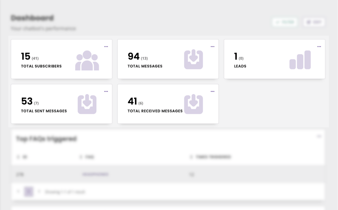
Your dashboard helps you monitor your chatbot’s performance.
Make it your own using a set of pre-built metrics, adding custom metrics, and organising it in a way that makes sense to you.
To start building your dashboard, go to the Dashboard.
Step 1: Add metrics to your dashboard
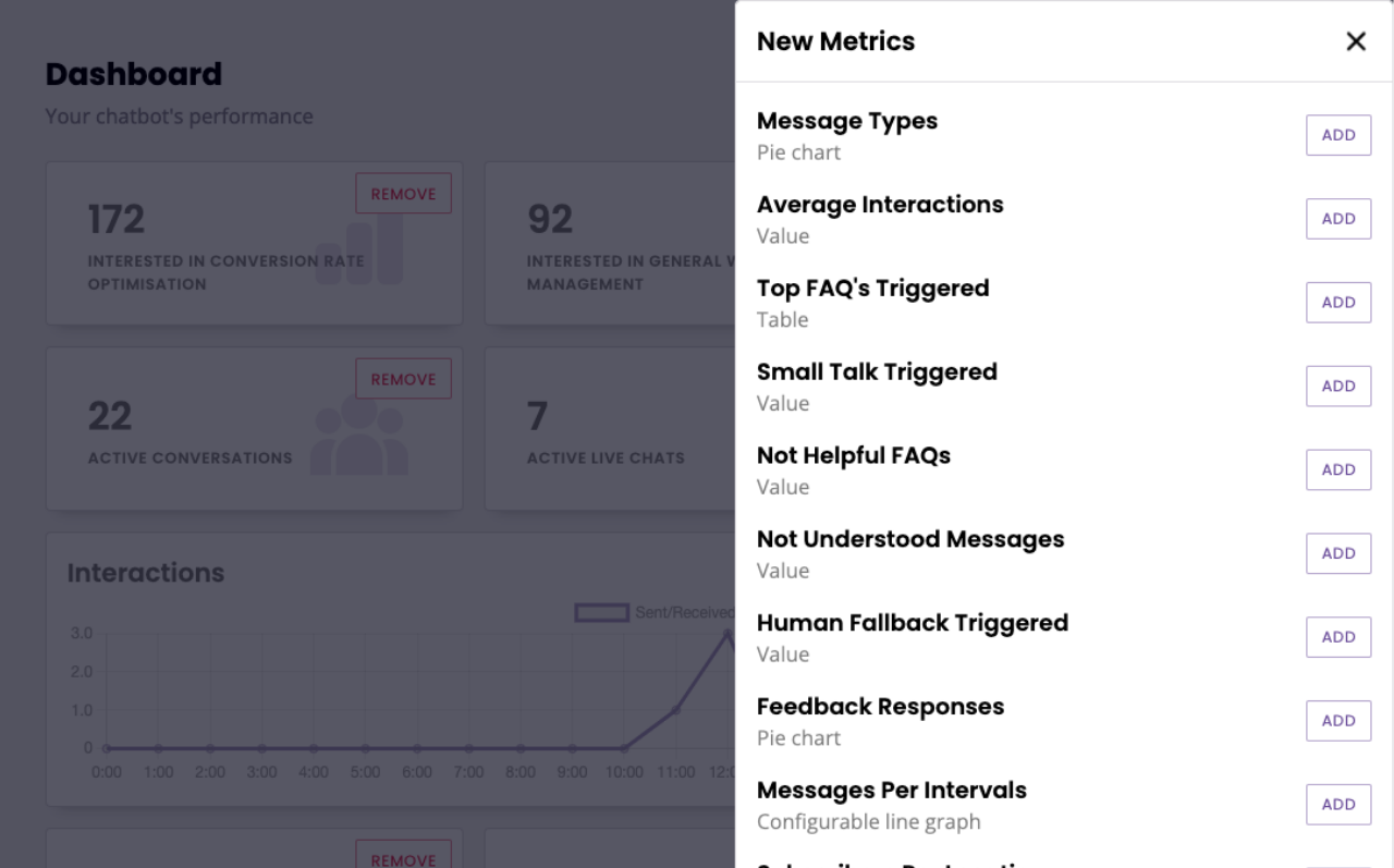
To add metrics, click Edit Your Metrics Now then View Metrics.
The panel shows all your available built-in and custom metrics.
Add a metric to the dashboard by clicking Add. This will instantly add that metric to your dashboard.
Once you’ve chosen all of your metrics, click the Close.
Step 2: Organise your dashboard
Each metric has its own tile on your dashboard.
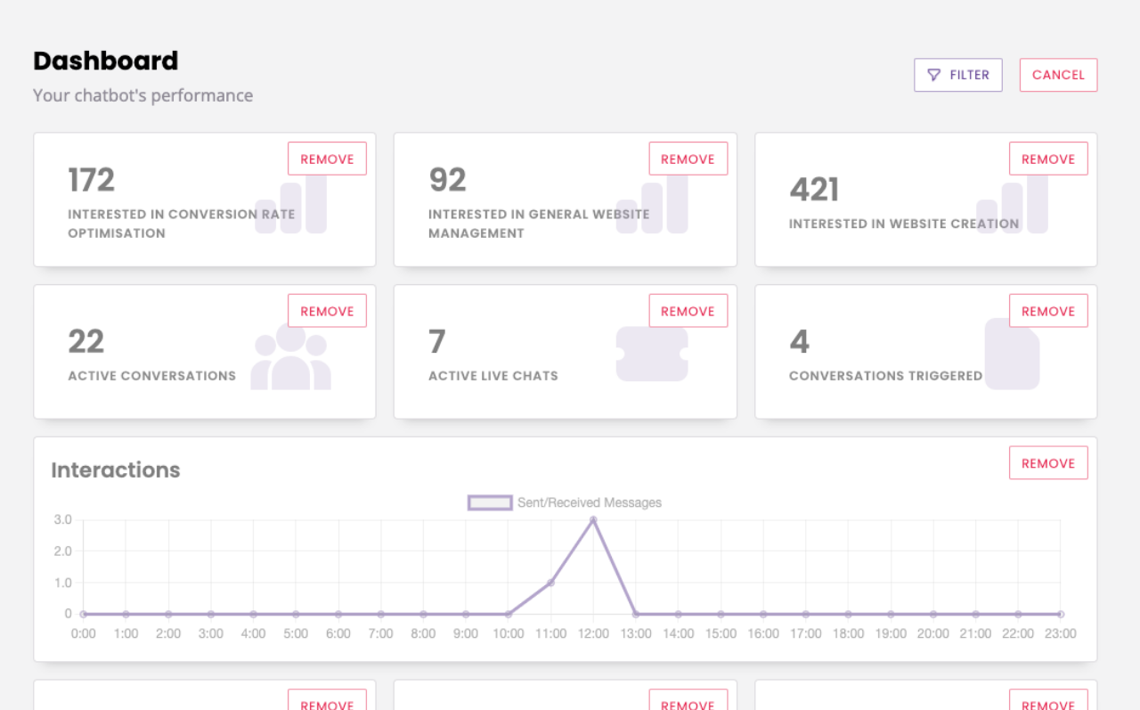
Click and drag each tile into your preferred position on the dashboard. You can also remove metrics by clicking Remove on the chosen metric.
Metrics can be re-added or removed at any time.
Happy with your changes? Click Save.
Step 3: Filter your dashboard
In the top right corner, click the Filter button.
You can filter your dashboard by a start and end date.
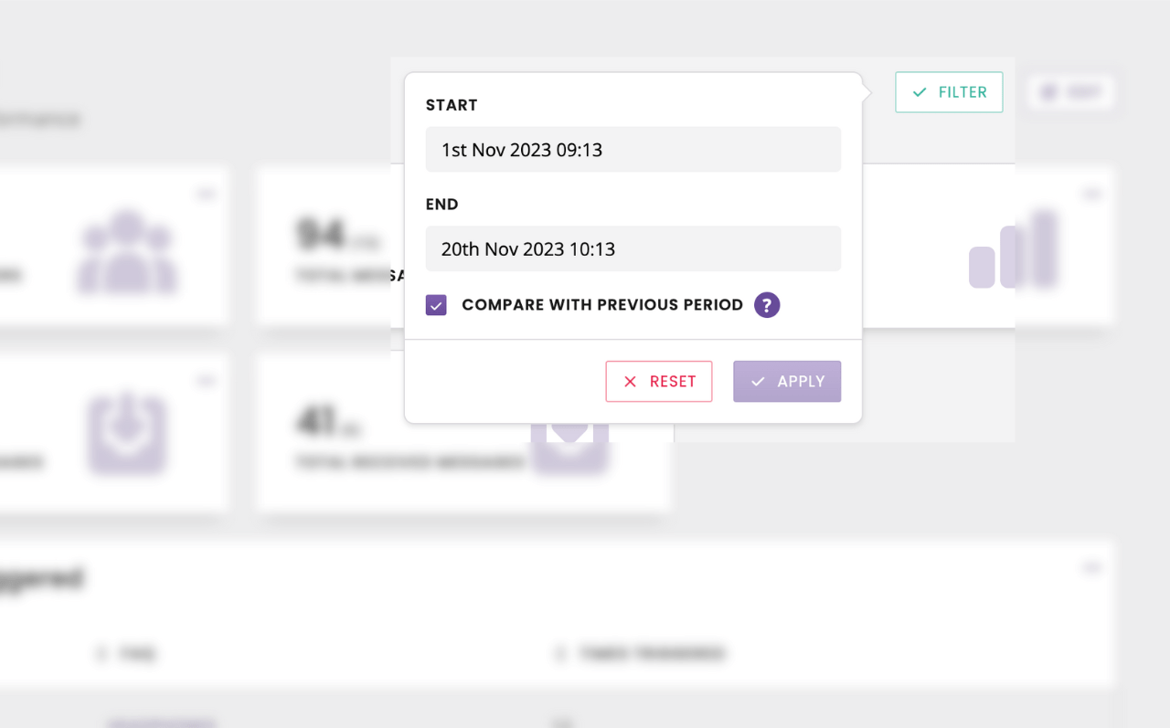
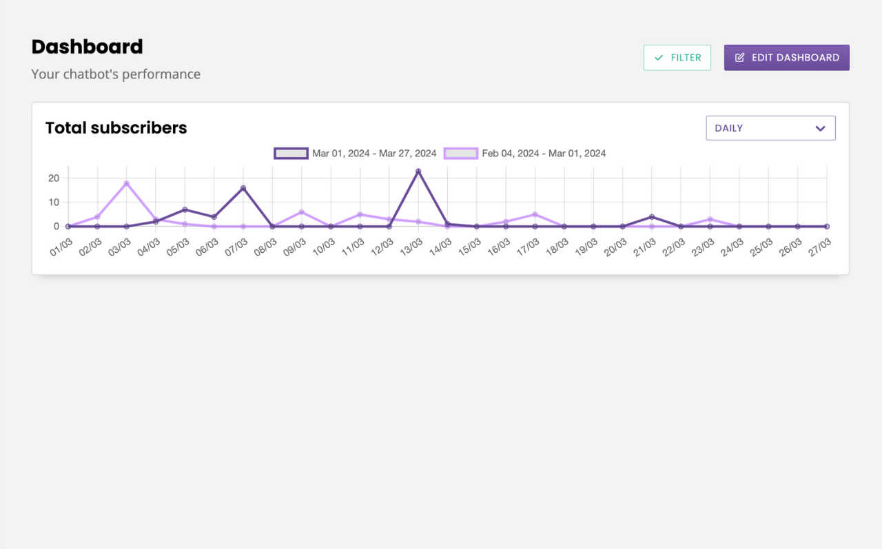
You can also apply a comparison filter which will compare the selected time period to the immediate previous time period of the same length (e.g. if you selected the last 7 days, it will compare to the previous 7 days).
Compared value data is represented in brackets.
Compared line chart data is represented by two lines of different colours, one per time period.