Design your chatbot widget
Last updated: 17 September 2024
Chat widgets appear in the bottom right of your website. To create an excellent chatbot experience, you want to make sure your chat widget reflects your brand.
Go to Engage → Channels. In the list of channels, find Converse and hit Options.
The preview section on the right displays your changes in real-time.
Any changes you make will only go live after you click Save.
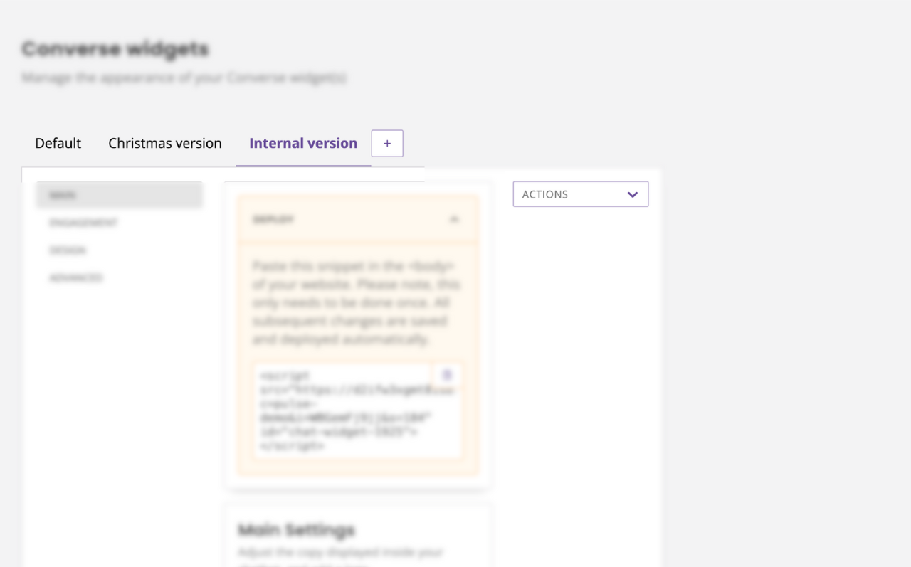
Main
Make your chatbot widget standout.
Within the Main settings area, you can change your chatbot’s logo and name. You can also choose whether you would like your chatbot to display its logo and name to your users by turning these on or off.
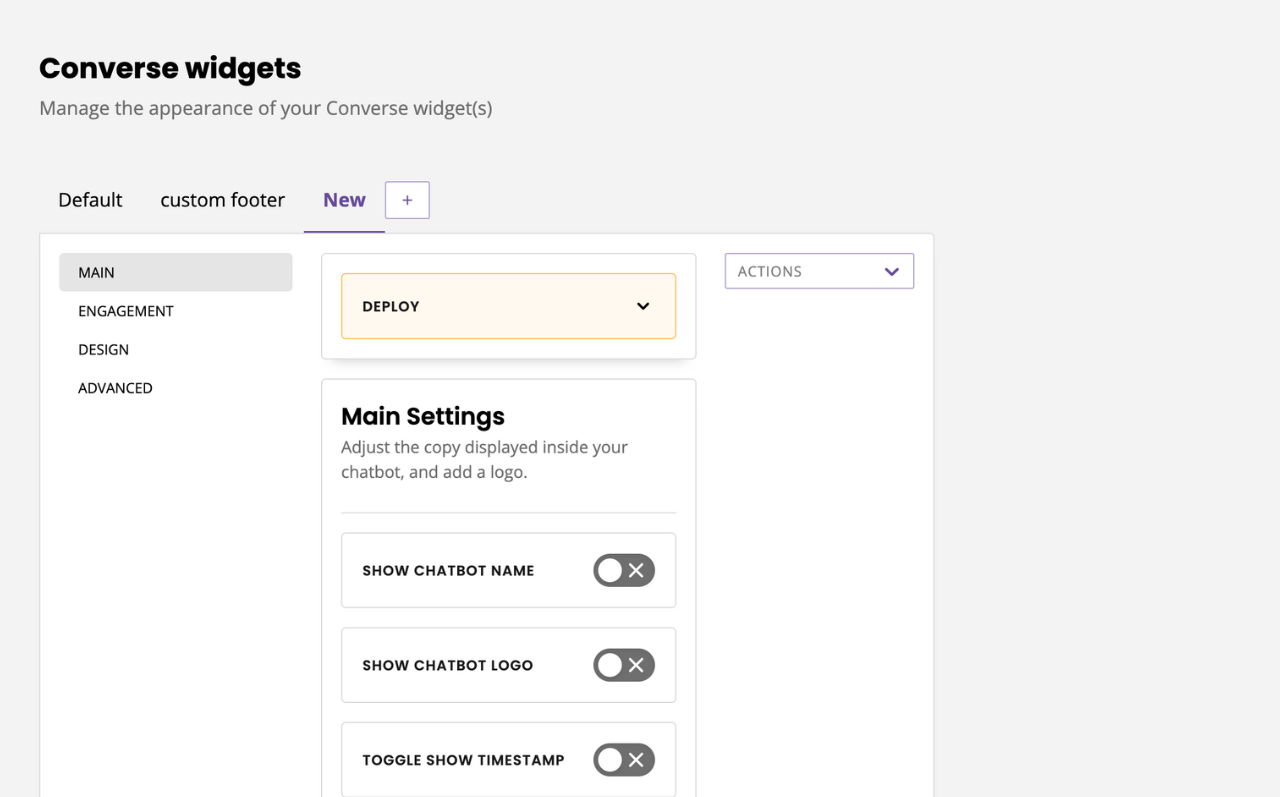
Under the main settings, you can:
Toggle your chatbot name on or off.
Toggle your logo on on or off.
Toggle your launcher logo on or off.
Toggle timestamps on or off.
Toggle reset on close on or off (learn more).
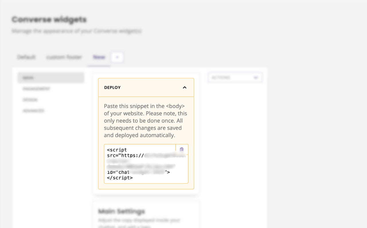
Finally, you will also find your chatbot deployment script. Here’s how to use it.
Engagement
Design how and when users will engage with your chat widget.
The Banner is an optional short message that users first see when they interact with your chatbot. This area is often used to inform users of your chatbot’s purpose.
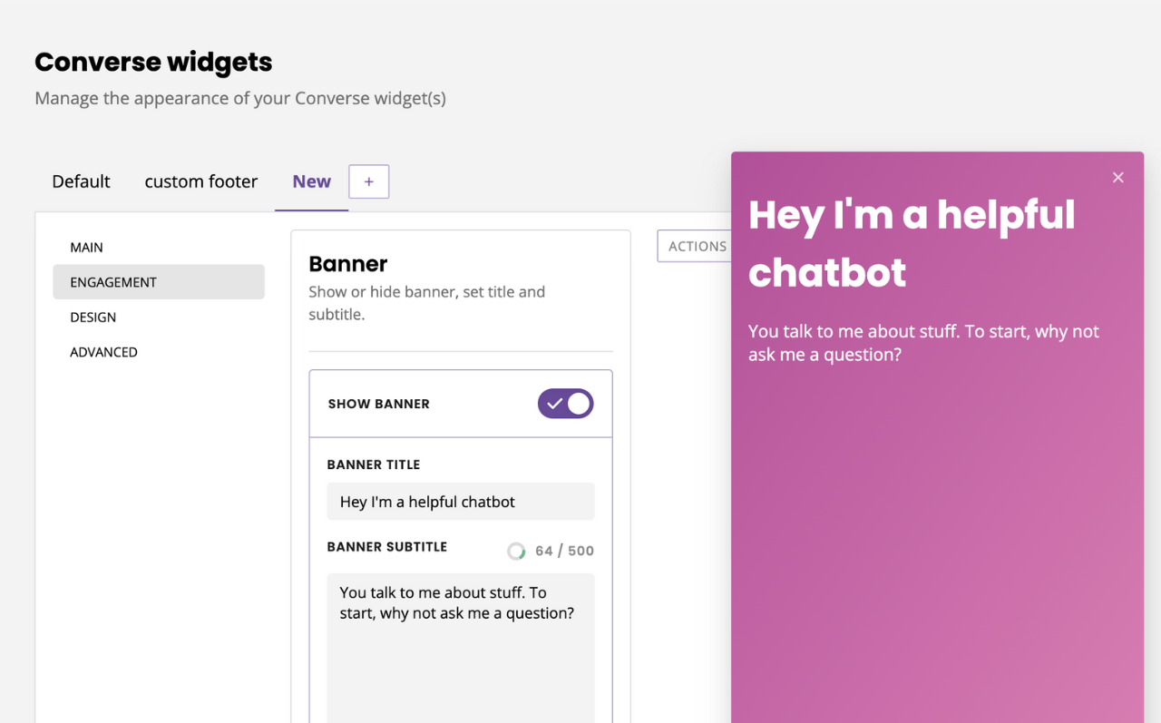
The banner has a 500 character limit.
Call-to-actions allow you to create custom messages that appear above your launcher; perfect to entice users to engage with your chatbot. Personalise your call-to-action’s text by clicking + New call-to-action. Here you can add a description of your call-to-action (for internal use only) and the message (what your users see). Learn more.
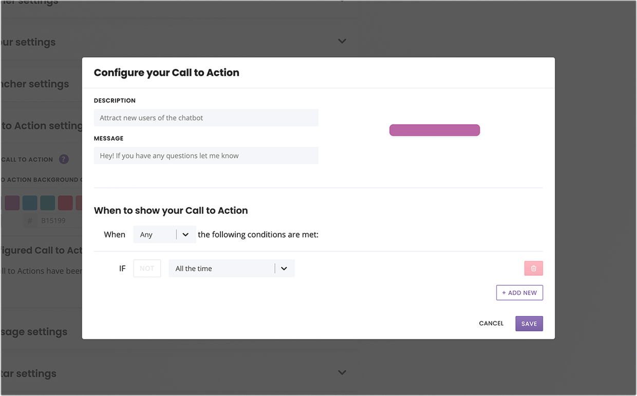
You can have multiple CTAs per chatbot.
Tailor when your call to action will be visible to users within the When to show your Call-to-Action area. This operates via triggers. To show your call-to-action to all users at all times, leave this as default.
Design your call-to-action’s colours to make it stand out. You can control its background and text colour.
Your call-to-action designs will apply to all your call-to-actions.
The Hamburger menu gives your users quick links to navigate to their desire outcome or flow faster.
Finally, the Display rules help you dictate how and when your widget will be visible (if at all) by your users. Learn more.
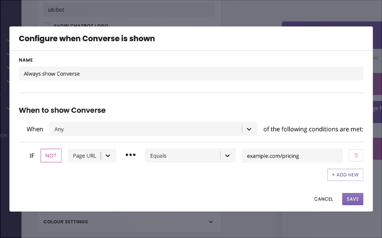
Display settings allow you to dynamically render your chat widget according to specific rules. For example, you can use these settings to hide the widget on your about us page.
Chat window settings allow you to decide whether the chatbot widget should be open or closed on specific pages. You can use the conditionals to create your rules. For example, you might want the chatbot’s window to consistently stay open even as web visitors navigate from page to page. By default, your chatbot’s window is closed.
Design
Customise every element of the colours and branding within your chat widget. You can choose from either the preset selection of colours or add hex codes to match your brand identity.
Under Colours, customise the colour of every element of your chat widget such as sent messages, text, gradients, and more.
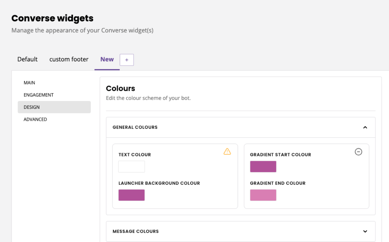
Pay attention to the yellow alert icons indicating whether your colour schemes is accessible or not.
Under Bot size, change the width and height of your chatbot. You may use rem or px. By default, the settings are 24rem width and 640px height (or click the handy Reset button).
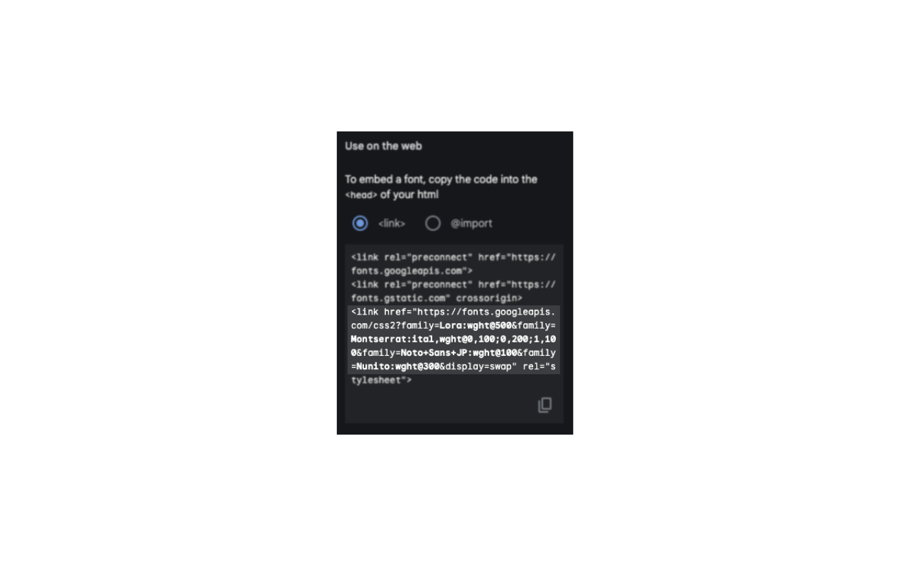
Want to use a different Font? Your widget supports most Google Fonts. Go to Google Fonts and select a few fonts, then copy and paste the Google source into the settings.
The Title Font and Bot Font drop-downs will automatically populate with the fonts you’ve chosen. Use the dropdown to select your font of choice. If you’re unhappy with your choice, hit Reset to get the factory default settings back.
Under Avatars, turn avatars on or off, use our default avatars or upload your own. The chatbot avatar and human avatar differentiate between messages from your chatbot and messages from your live chat agents.
Advanced
Tweak your widget settings to give or revoke the ability for chatbot users to
Reset their chatbot conversation.
Download their chat transcript
Export all data associated with them
Delete all data associated with them
Once you are happy with your changes, click Save.
Head to Demo to see your beautiful, on-brand chatbot.
Add, duplicate, or delete a widget
Create as many widget designs as you might need. The tab system and the right-side menu allow you to duplicate, rename, or delete widget versions:
Each widget is a different face of the same chatbot with its own unique deployment script.
Learn more about creating multiple widgets.